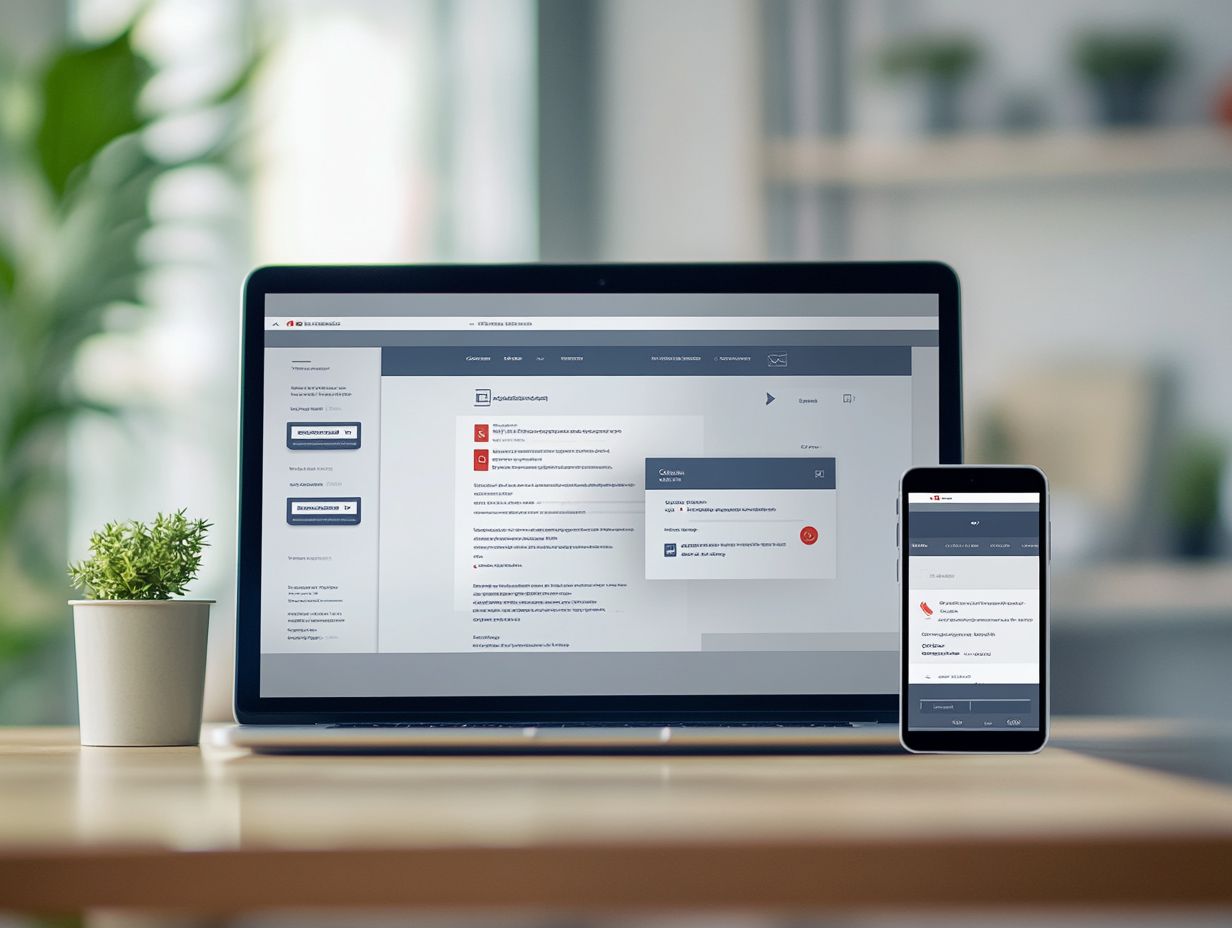
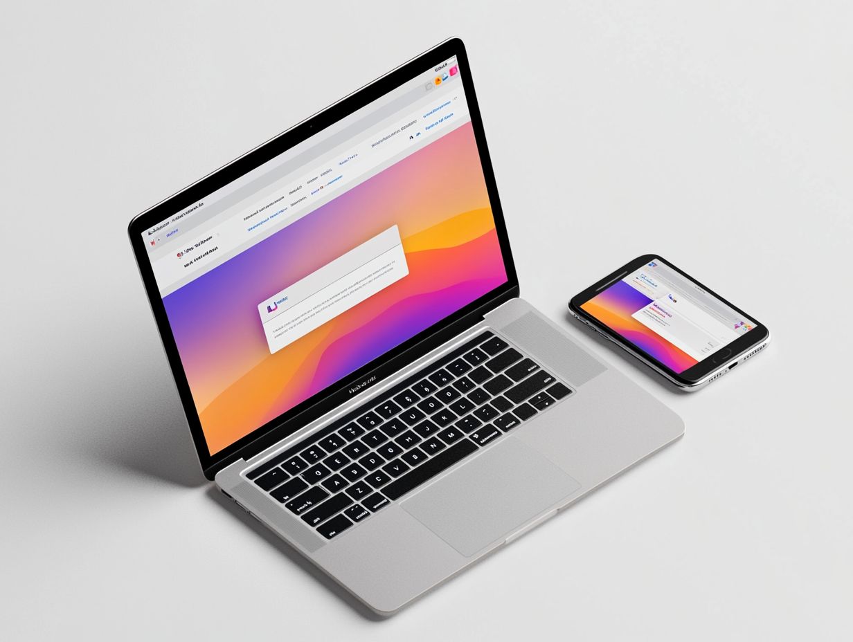
The Benefits of Responsive Email Design
Let's Set Up Your Lead Generation Strategy
Fill out the form below, and our team will get in touch with you to create a tailored solution for your business.
In today’s fast-paced digital landscape, where emails are accessed across many devices, embracing responsive email design is absolutely vital for effective communication.
This guide delves into the essentials of responsive email design, highlighting its importance in email marketing and how it significantly boosts user engagement.
You’ll discover best practices for crafting adaptable layouts, valuable tools and resources at your disposal, and strategies for measuring the success of your initiatives.
Get excited! It’s time to transform your email campaigns into captivating experiences that every subscriber will love!
Contents
- Key Takeaways:
- Understanding Responsive Email Design
- Why Responsive Design is Important for Email Marketing
- Let's Set Up Your Lead Generation Strategy
- Best Practices for Responsive Email Design
- Let's Set Up Your Lead Generation Strategy
- Tools and Resources for Responsive Email Design
- Email Templates and Builders
- Testing and Analytics Tools
- Measuring the Success of Responsive Email Design
- Key Metrics to Track
- Let's Set Up Your Lead Generation Strategy
- Case Studies and Examples
- Frequently Asked Questions
- What is responsive email design and why is it beneficial?
- How does responsive email design improve user experience?
- What are the advantages of using responsive email design for businesses?
- How does responsive email design impact email marketing success?
- Can responsive email design save businesses time and resources?
- What are the future prospects for responsive email design?
Key Takeaways:

- Responsive email design increases mobile engagement and improves user experience, making it essential for successful email marketing campaigns.
- Designing for different screen sizes and optimizing for mobile devices are key best practices for responsive email design.
- Using email templates and builders, as well as testing and analytics tools, can aid in creating effective responsive emails.
Understanding Responsive Email Design
Responsive email design is an essential element of contemporary email marketing, allowing you to optimize your campaigns for mobile devices. This ensures your messages look great on all devices and email programs.
By using techniques like CSS media queries which is special code that adjusts styles based on device size and a streamlined single-column layout, you can enhance user experience while maintaining brand consistency in your newsletters and promotional emails.
What is Responsive Email Design?
Responsive email design is all about crafting mobile-friendly emails that effortlessly adapt to various screen sizes and devices. This approach not only enhances user experience but also elevates your email performance.
Using HTML principles, you can ensure that your content looks stunning and remains accessible on smartphones, tablets, and desktops alike. In today s digital landscape, where a considerable number of email opens happen on mobile devices, emphasizing mobile-friendly formats is essential.
By prioritizing responsive designs, you can substantially boost engagement rates. Recipients are far more likely to interact with emails that are visually appealing and easy to navigate. This thoughtful design can lead to higher conversion rates and lower unsubscribe rates, as your audience will appreciate the convenience and clarity that well-structured emails provide.
Why Responsive Design is Important for Email Marketing
Responsive design is essential in email marketing, enabling you to engage your audience effectively on mobile devices, which are increasingly dominating email opens and interactions.
This design strategy also elevates your click-through rates. The result? Improved conversion rates and a more satisfying experience for your users.
Increasing Mobile Engagement
Increasing mobile engagement is crucial for maximizing the effectiveness of your email marketing efforts. You can achieve this by crafting mobile-friendly emails that are visually appealing and easy to navigate.
To elevate engagement even further, prioritize content that truly resonates with your audience. Ensure that essential information is readily accessible without requiring excessive scrolling.
Incorporating compelling calls-to-action will encourage recipients to take desired actions, whether that means clicking through to your website or participating in a promotion.
Let's Set Up Your Lead Generation Strategy
Fill out the form below, and our team will get in touch with you to create a tailored solution for your business.
By using mobile-specific design elements like larger fonts, bold visuals, and touchscreen-friendly buttons you can create a seamless user experience. These strategies not only inspire users to interact with your content but also significantly enhance click-through rates and overall email performance.
Now is the time to implement these strategies and watch your email campaigns thrive!
Improving User Experience

Improving user experience should be a top priority in your responsive email design. It directly impacts subscriber satisfaction and retention rates.
By effortlessly adapting your content across various devices, you can ensure that important information remains easily digestible. This is crucial no matter the screen size.
This means selecting layouts that minimize visual clutter. It allows your users to hone in on key messages without being sidetracked by unnecessary distractions.
Optimizing for Dark Mode not only boosts readability. It also aligns with the preferences of today s audience, who increasingly favor this feature.
Utilizing responsive frameworks and templates is vital in this endeavor. They equip you with the tools and guidelines needed to create adaptable designs that consistently uphold high standards of user engagement.
Best Practices for Responsive Email Design
Follow best practices to ensure compatibility across various email clients and devices. This approach facilitates seamless layout adjustments and significantly enhances the overall user experience.
Designing for Different Screen Sizes
Designing for various screen sizes is essential in responsive email design. You need to ensure that your content remains legible and accessible across a spectrum of devices, from smartphones to tablets and desktops.
A thoughtfully executed layout strategy can significantly elevate the user experience. It’s vital to leverage fluid grids that adjust according to the screen’s dimensions.
Utilizing media queries special CSS rules that change how content looks based on the device size allows you to apply specific styles tailored to each device type. This ensures that your imagery and text resize beautifully without losing clarity.
Adaptive techniques, such as using single-column layouts for mobile devices, can simplify navigation. Incorporating larger buttons enhances usability.
Look at successful brands like Starbucks and Airbnb; they exemplify this adaptability by seamlessly guiding users through their emails, regardless of the device. They prioritize essential content and optimize call-to-action buttons for touch interactions, making the experience effortless for their audience.
Optimizing for Mobile Devices
Don t miss out! Optimizing your emails for mobile devices is a game-changer for capturing clicks and connecting with your audience.
Let's Set Up Your Lead Generation Strategy
Fill out the form below, and our team will get in touch with you to create a tailored solution for your business.
This means you should strategically prioritize your content. Ensure that the most important information grabs the reader’s attention right away.
By adopting single-column layouts, you can create a sleek and user-friendly experience. This allows your readers to navigate effortlessly without the distractions of cluttered designs.
Incorporating appropriately sized call-to-action buttons can significantly boost user engagement. These thoughtful optimizations enhance the visual appeal of your emails and lead to higher engagement rates, ultimately driving conversions and fostering stronger connections with your audience.
Tools and Resources for Responsive Email Design
Utilizing the right tools and resources is essential for crafting successful responsive email designs. By doing so, you can streamline your workflow and significantly enhance your email performance.
Start optimizing your emails today to boost engagement!
Email Templates and Builders

Email templates and builders are essential for you, enabling responsive design that adjusts to fit any device screen, making it easier for viewers to read. This helps you craft visually stunning and professional emails effortlessly.
These tools make email creation a breeze! They allow you to concentrate on your content instead of getting bogged down by technical intricacies. With responsive design, your emails automatically adjust to fit various screen sizes, ensuring that recipients can easily view them on smartphones, tablets, or desktops without any hassle.
Popular email marketing platforms like Mailchimp and Constant Contact provide an impressive selection of customizable templates that not only support responsive designs but also boost user engagement through well-structured layouts. These features lead to higher open and click rates, making your email marketing endeavors significantly more impactful.
Testing and Analytics Tools
Testing and analytics tools are essential for evaluating the performance of responsive emails and ensuring that your emails land in inboxes across various email clients.
These tools allow you to explore past campaign data, offering invaluable insights into how your campaigns resonated with recipients. By analyzing key metrics such as open rates, click-through rates, and bounce rates, you can pinpoint which elements of your emails hit the mark and where there’s room for improvement.
Tracking email performance over time helps you identify trends, enabling you to refine your email marketing strategies effectively. This iterative process enhances engagement levels and maximizes your overall return on investment. By aligning future campaigns with the preferences and behaviors of your audience, you ensure that your messaging continues to resonate.
Measuring the Success of Responsive Email Design
Measuring the success of responsive email design is essential for grasping its influence on email marketing metrics. By doing so, you can skyrocket your overall engagement and conversion rates, ensuring that your campaigns resonate effectively with your audience.
Key Metrics to Track
Key metrics to track in responsive email design include engagement rates, click-through rates, and unsubscribe rates, each offering valuable insights into the effectiveness of your email campaigns.
By understanding these metrics, you can fine-tune your approach, ensuring your emails not only reach their audience but also genuinely resonate with them. Engagement rates reveal how many recipients interact with your content, underscoring the relevance of what you re presenting. Click-through rates indicate how well your email drives action, signaling whether your call to action is compelling enough to prompt a response. Unsubscribe rates can highlight potential pitfalls, such as content misalignment or overwhelming frequency.
Let's Set Up Your Lead Generation Strategy
Fill out the form below, and our team will get in touch with you to create a tailored solution for your business.
By analyzing these metrics, you can refine your designs and content strategies. This means optimizing layouts for various devices and experimenting with different elements like subject lines and images to enhance overall performance in future campaigns.
Case Studies and Examples
Case studies and examples of successful responsive email design provide you with invaluable insights into effective strategies and best practices that can elevate your email campaign performance.
By examining distinct marketing campaigns that have truly mastered the art of responsive design, you can uncover essential elements such as mobile optimization, visually appealing layouts, and user-friendly interfaces. For instance, consider how a leading retail brand managed to boost its click-through rates significantly by implementing a fluid grid system, allowing its emails to adapt effortlessly across various devices. These thoughtful adaptations not only enhanced readability but also fostered greater customer engagement.
Learning from these real-world applications can serve as a guiding light for your future email marketing efforts, empowering you to create campaigns that not only reach but truly resonate with your audience, ultimately driving higher conversion rates.
Frequently Asked Questions

What is responsive email design and why is it beneficial?
Responsive email design which means emails adapt to fit any screen size is essential. It creates email messages that are optimized for different devices, allowing for a seamless viewing experience for recipients, regardless of the device they are using.
How does responsive email design improve user experience?
Responsive email design makes emails easy to read and look good on all devices. This results in a more positive user experience, leading to increased engagement and higher click-through rates.
What are the advantages of using responsive email design for businesses?
Responsive email design helps businesses reach a wider audience. It makes emails accessible and easy to read on all devices. This feature contributes to maintaining brand consistency and improves overall user experience.
How does responsive email design impact email marketing success?
Responsive email design plays a crucial role in the success of email marketing campaigns. It ensures messages are delivered effectively and consistently on all devices, leading to higher open and click-through rates. Ultimately, this results in increased conversions and revenue.
Can responsive email design save businesses time and resources?
Yes, responsive email design can save businesses time and resources. It eliminates the need to create multiple versions of an email for different devices and reduces the risk of errors, as there is only one version of the email to manage.
What are the future prospects for responsive email design?
The future prospects for responsive email design are very promising. More people are accessing emails on mobile devices, making it a must-have for businesses. Companies that adopt it now will gain a crucial edge in the competitive digital world!


